OTTO
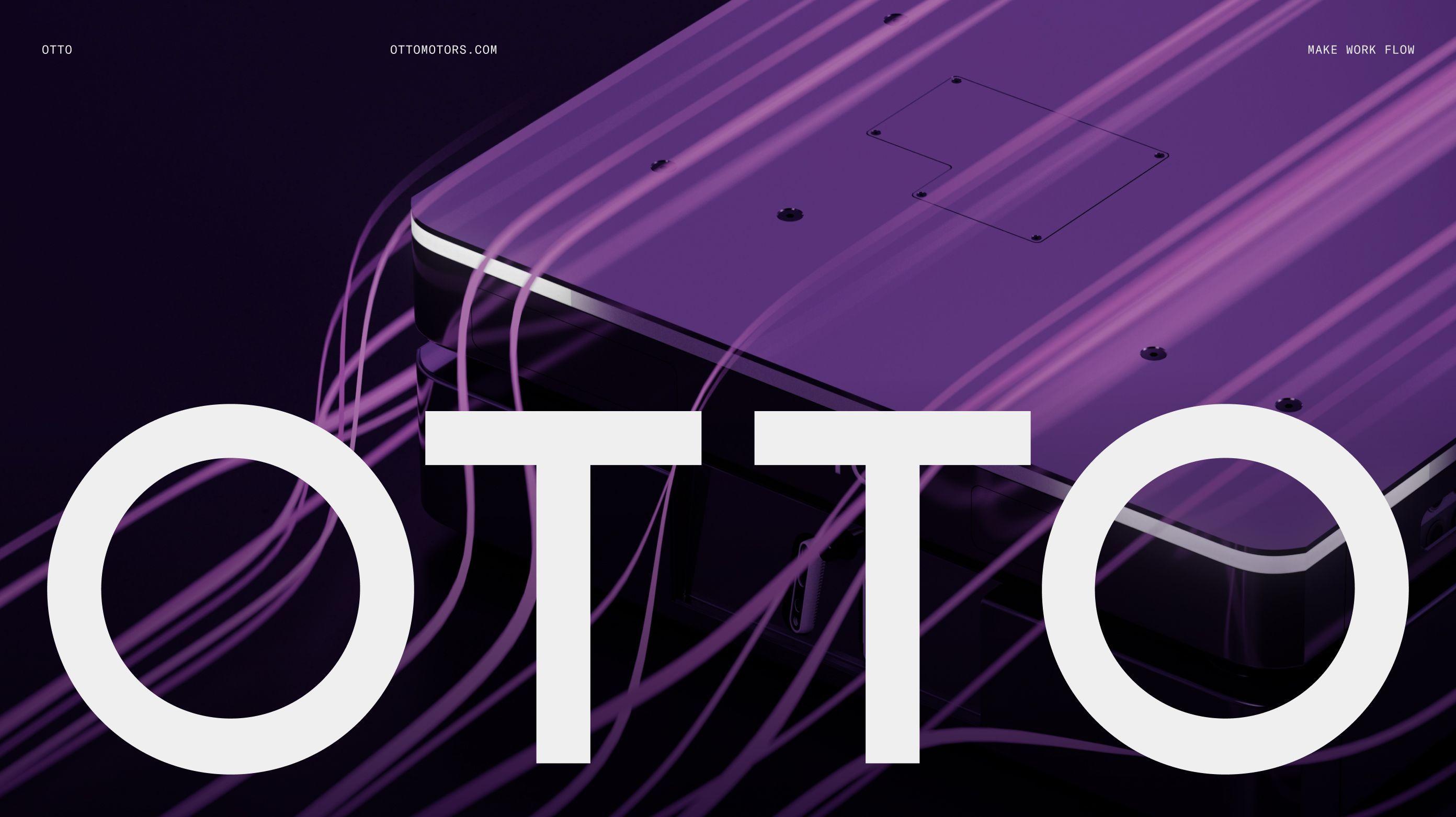
OTTO's autonomous mobile robots are an example of category excellence. We built a brand and digital experience to match.
Work that Works
In the 3 months following the launch of the new brand and website, OTTO received a distinct spike in community engagement, with increased lead generation and user retention.
17%
22%
A start-up built on the ambition to rid the world of land mines, OTTO now serve the supply chains of multiple Fortune 500 companies. Prior to engaging with us, their proposition was largely based on innovation. But with copycat brands cropping up every other day in every other market, OTTO needed to carve out a new position that could both protect their legacy of innovation and establish them as the rightful category leaders. Our simple meme of “Make Work Flow” helped them to assert leadership in the category once more, securing their acquisition by Rockwell Automation in late 2024.
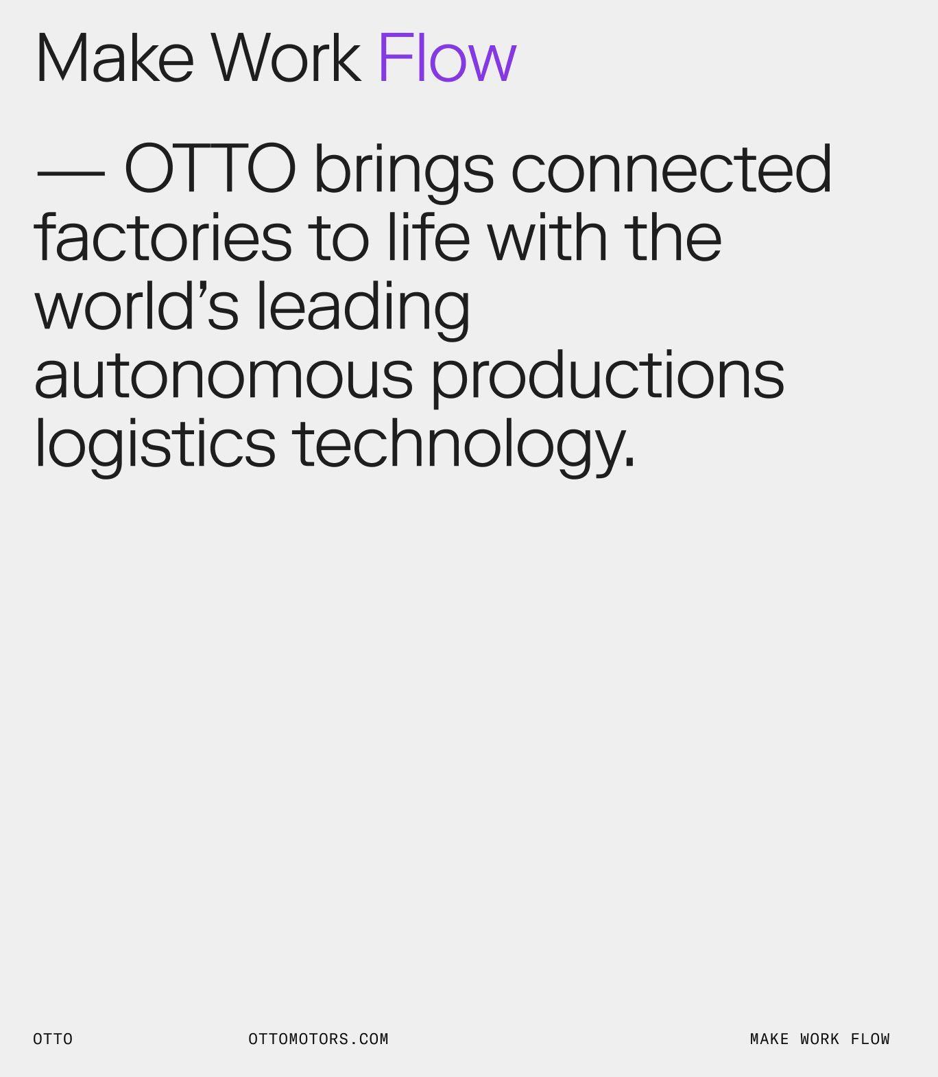

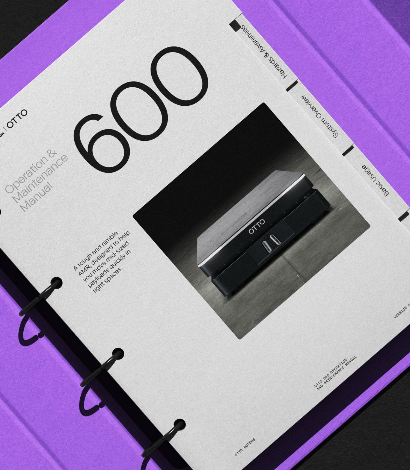
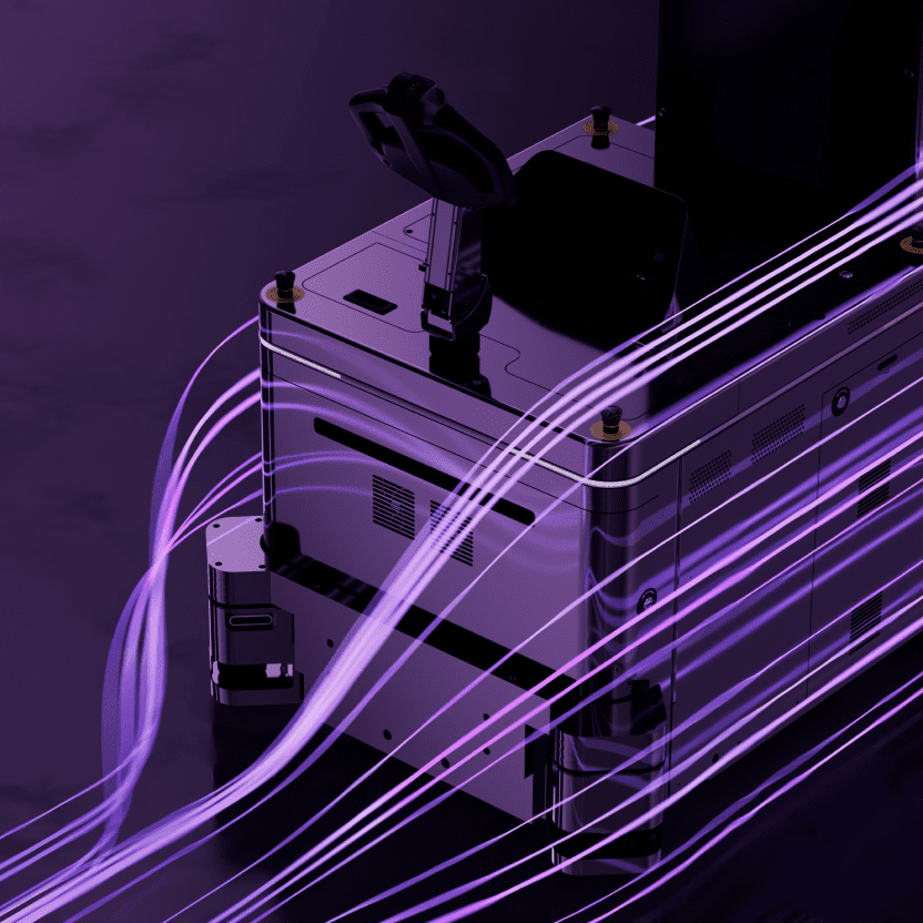
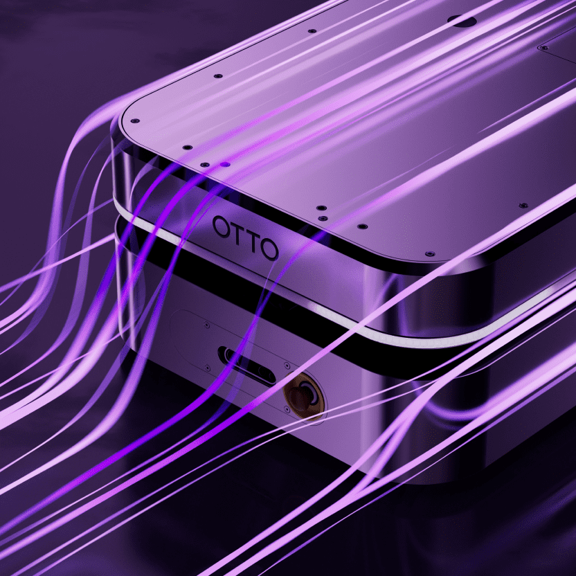
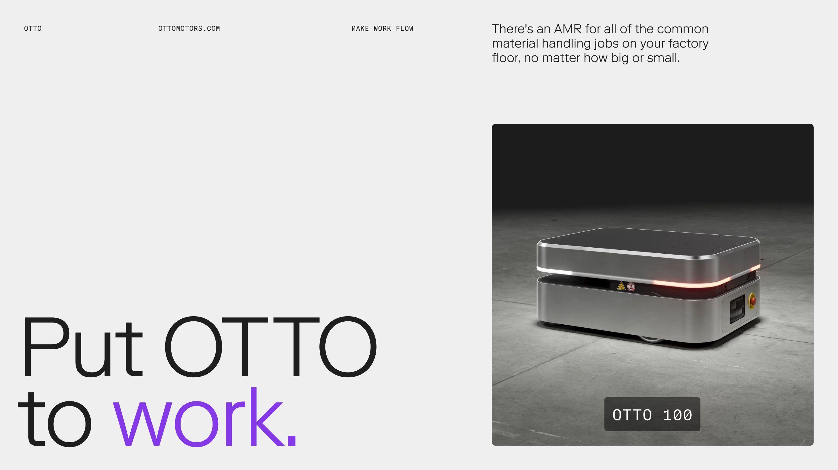
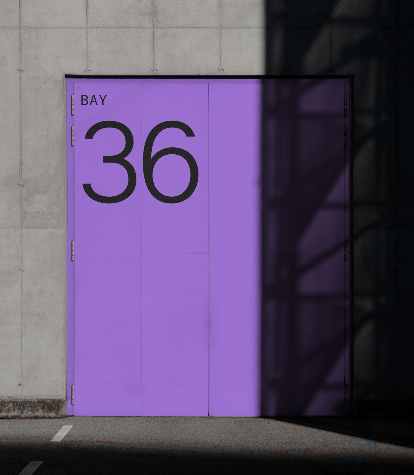
In an industry obsessed with product specifications, we focused on the benefits. Bold use of colour compliments both static and moving product images to show the the "flow" that can be achieved when OTTO's are included in a factory.
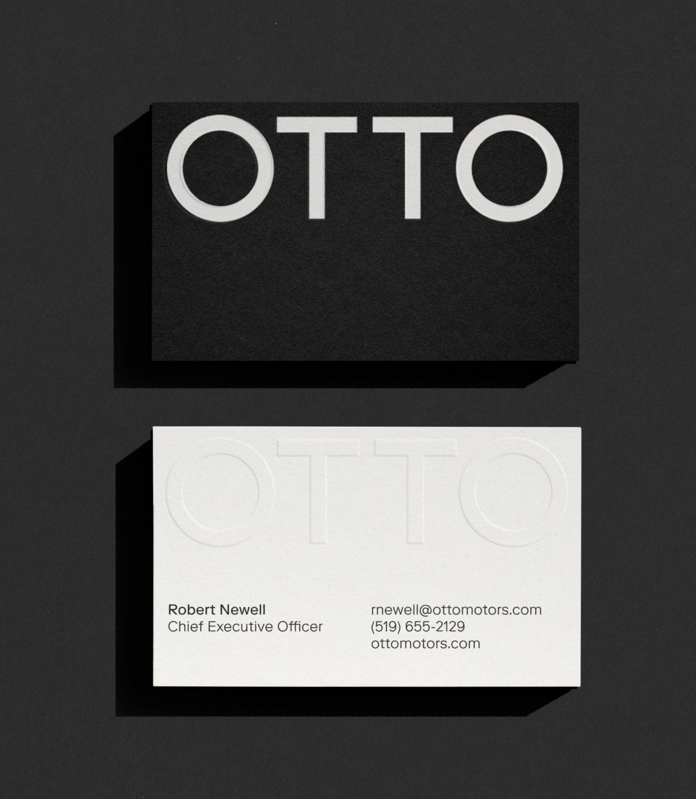
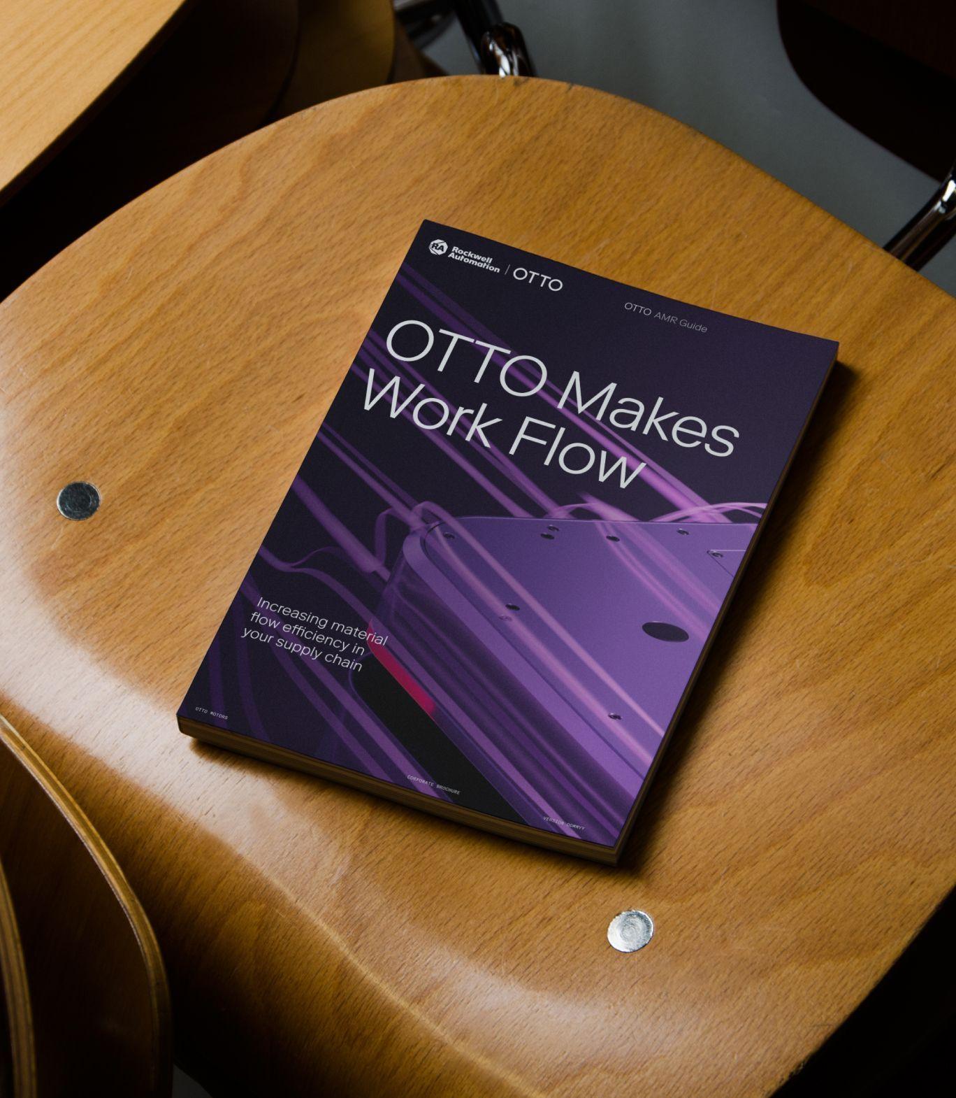
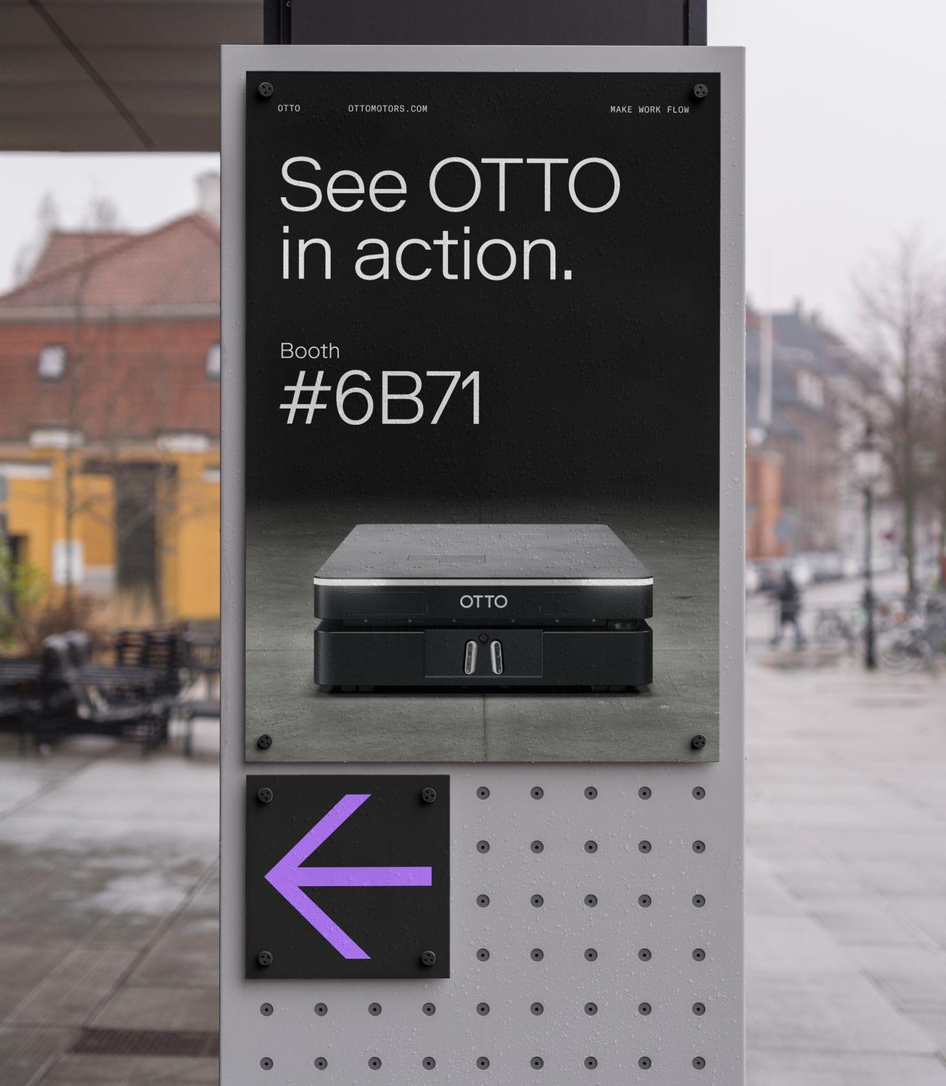
In the first quarter after launch, OTTO’s new website clocked a 17% increase in contact submissions and a 22% increase in returning users. We like to think the interactive spinning robot component we built had something to do with it.
OTTO's ToolKit™
Logo

Typography

Colours
Off-Black
#1E1E1E
Black
#0F0F0F
Light Grey
#DEDEDE
Off-Black
#1E1E1E
Off-White
#EFEFEF
Light Grey
#DEDEDE
White
#FFFFFF
Off-White
#EFEFEF
Ultra
#8438E8
Ultra Light
#B277FD
Button
Imagery

